Docs
Forecast & What if
The 3 a.m. question, answered on a chart: if nothing else books, when does the money run out?
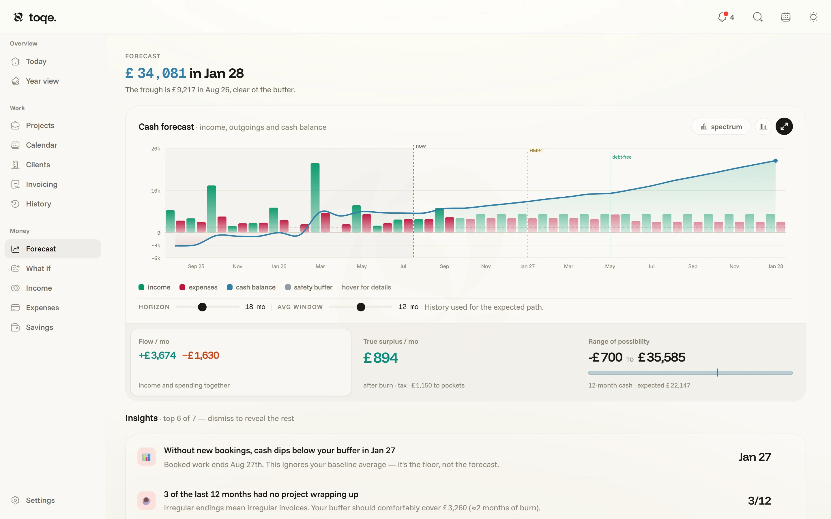
What the simulation does
Starting from your balance now, toqe plays the months forward: each project’s money lands when it should — spread across its worked days, delayed by your invoice lag and the client’s payment terms — bills land on their dates, allowances burn at their monthly rate, and tax is held back as income arrives, then paid out at your country’s real deadlines.
The headline is that balance — click it to type what your account really holds; money already held for tax doesn’t count, the tax pot tracks that. Under it, in green or red, is how far it moves by the end of the chart, then the trough — the lowest the line dips, and whether that clears your safety buffer. The buffer figure in that sentence is editable too.
Reading the chart

The line is your balance, the dashed grey line the buffer it shouldn’t cross, and now stands where the past meets the future. Hover the chart for any month’s figures, and for the moments that bend the curve — a tax deadline, the month a debt clears. The chips in the panel head set it up:
- line / bars — the line alone, or with each month’s money in (mint) and out (rose) as bars under it.
- range — a band of possibility: your recent months, low to high, run through the same forecast. It appears once three paid months give it something to go on.
- baseline — what happens after booked work ends. Assume nothing draws the floor; your recent average keeps you earning at what the last 6, 12, 18 or 24 months paid you.
- horizon — how far ahead it looks; click to cycle 6 → 12 → 18 → 24 → 36 months.
Four cards sit under the chart: Income / mo (your average over the past months, after tax), Spending / mo (bills and allowances), Cash in 12 mo, and the Debt-free month if you carry a debt on Savings.
Insights
Under the chart, the attention engine reads the same numbers and says what it sees: how long the runway holds without new bookings, your heaviest month ahead, your biggest recurring costs, what a debt costs in interest alone. Click one and the chart picks out its month. Insights are observations, not chores — they never count toward the bell’s badge, and dismissing one is remembered until the facts behind it change. A few name somewhere worth going: the booked-days one offers Try it in What if.
What if
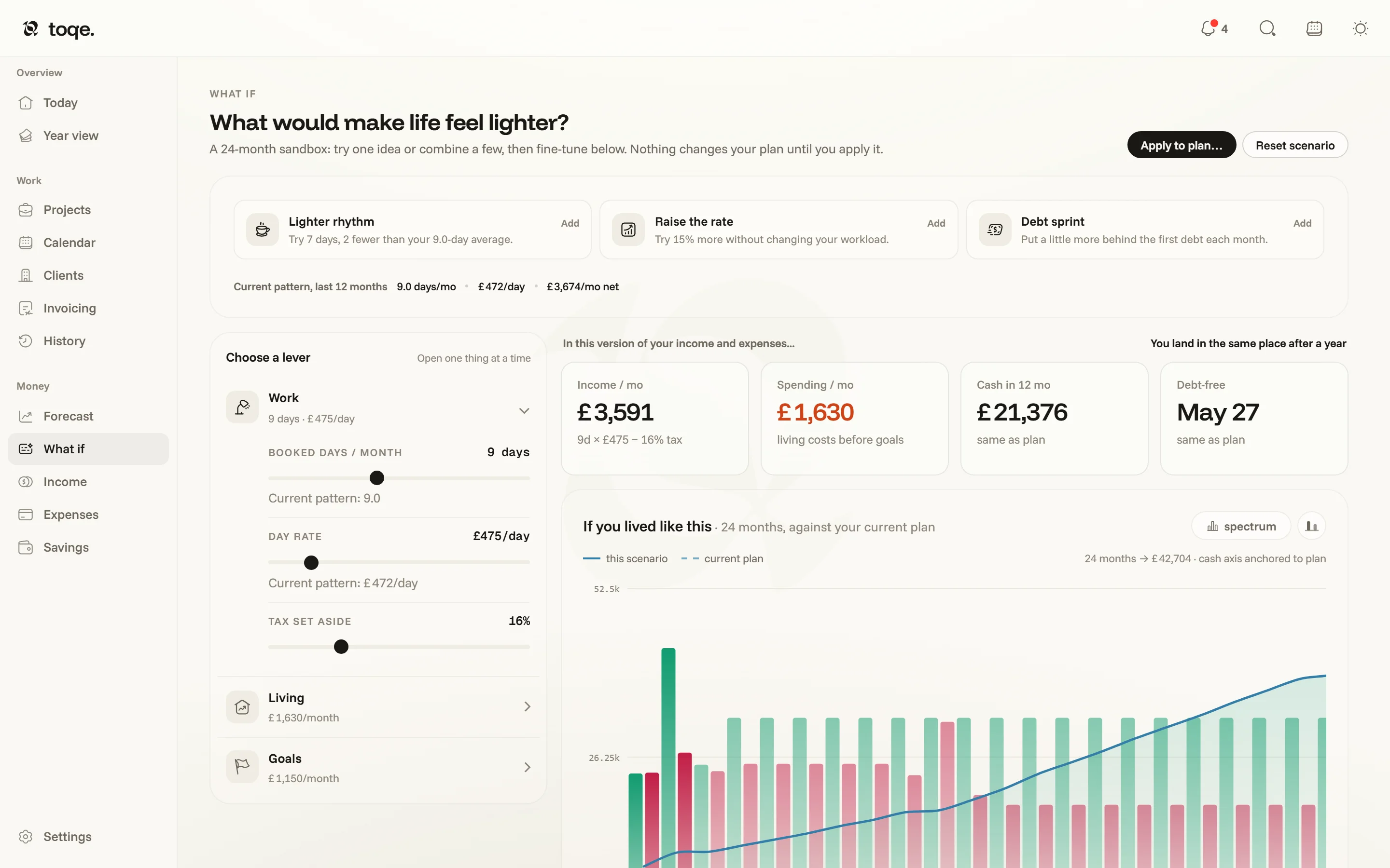
The what if chip turns the Forecast into a sandbox on a copy of your numbers — nothing changes your plan until you apply it. A purple banner says so under the heading, the page’s headings and borders turn purple, and the chart draws your scenario as the solid line against the plan, dashed. Back to the plan in the banner (or the chip again) leaves.
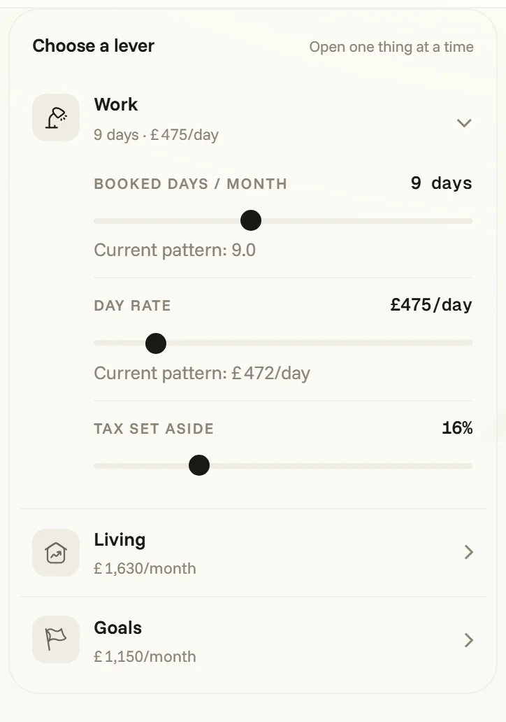
Start from an idea — Lighter rhythm, Raise the rate, Debt sprint — or pull the levers yourself: Work (booked days a month, day rate, tax set-aside, each against your current pattern), Living (your business and personal spending, plus room for something else) and Goals (what each savings pocket gets). The four cards under the chart switch to the scenario’s figures, each saying how it moved against the plan. Beside the levers, Can I afford…? checks a purchase against this scenario, one-off or recurring, and says whether you’d stay above your buffer. Apply to plan… lets you tick which changes to keep; Reset walks away clean.